← News
2026.06.29
Pantone が AIRSORAYAMA 専用カラーを開発Pantone Develops a Bespoke Color for AIRSORAYAMAPantone 為 AIRSORAYAMA 開發專用色彩Pantone crea un color exclusivo para AIRSORAYAMA
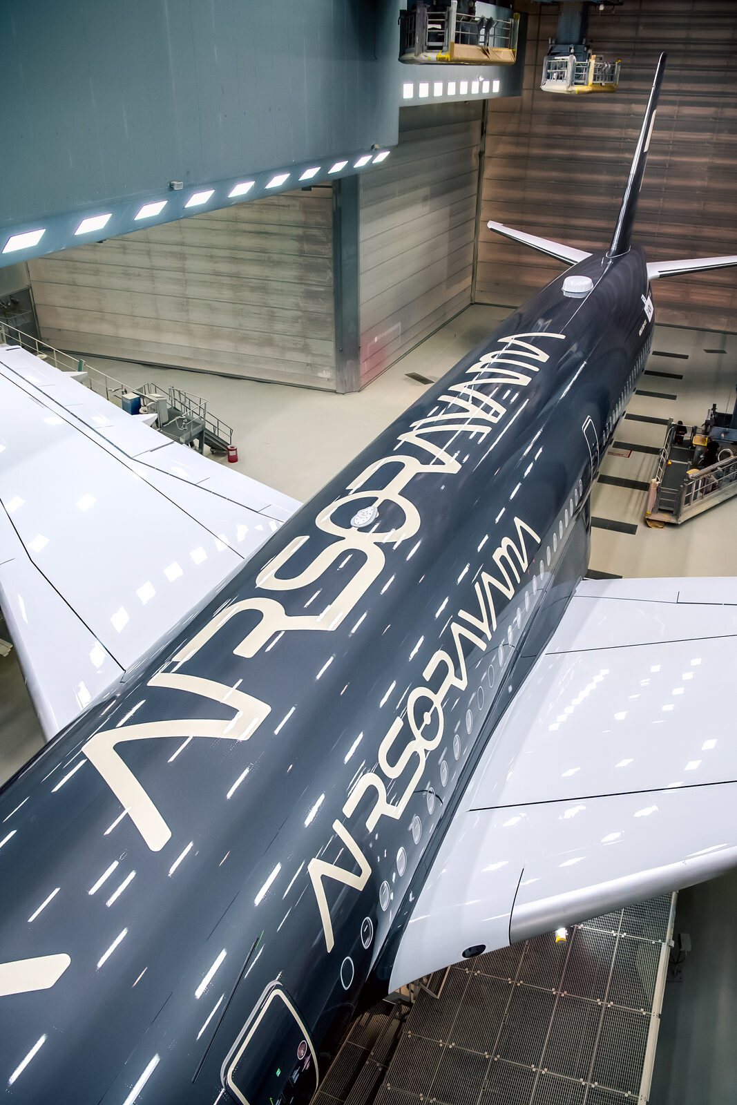
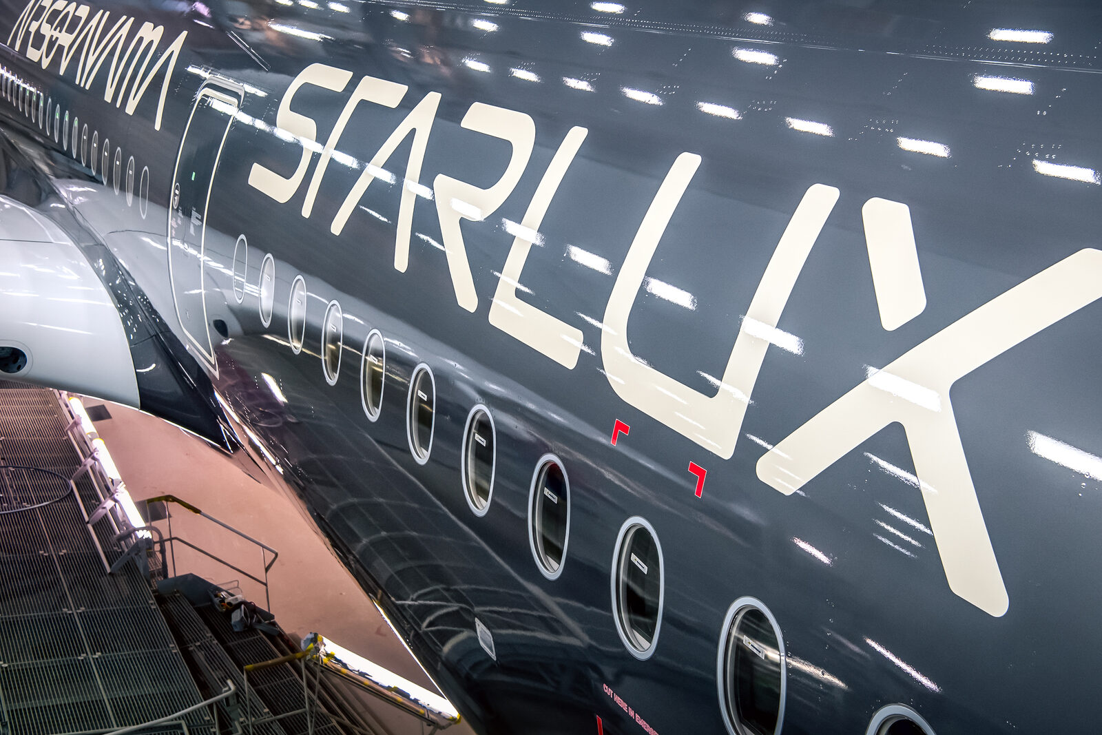
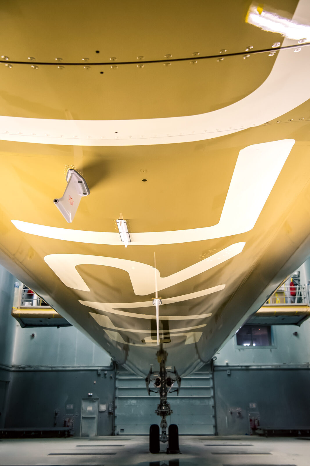
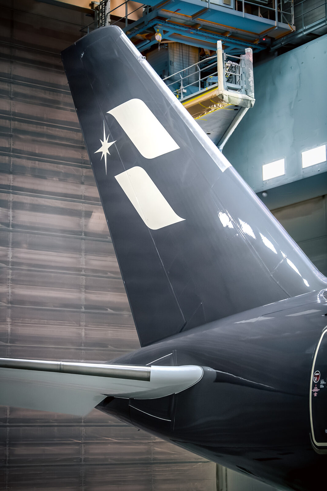
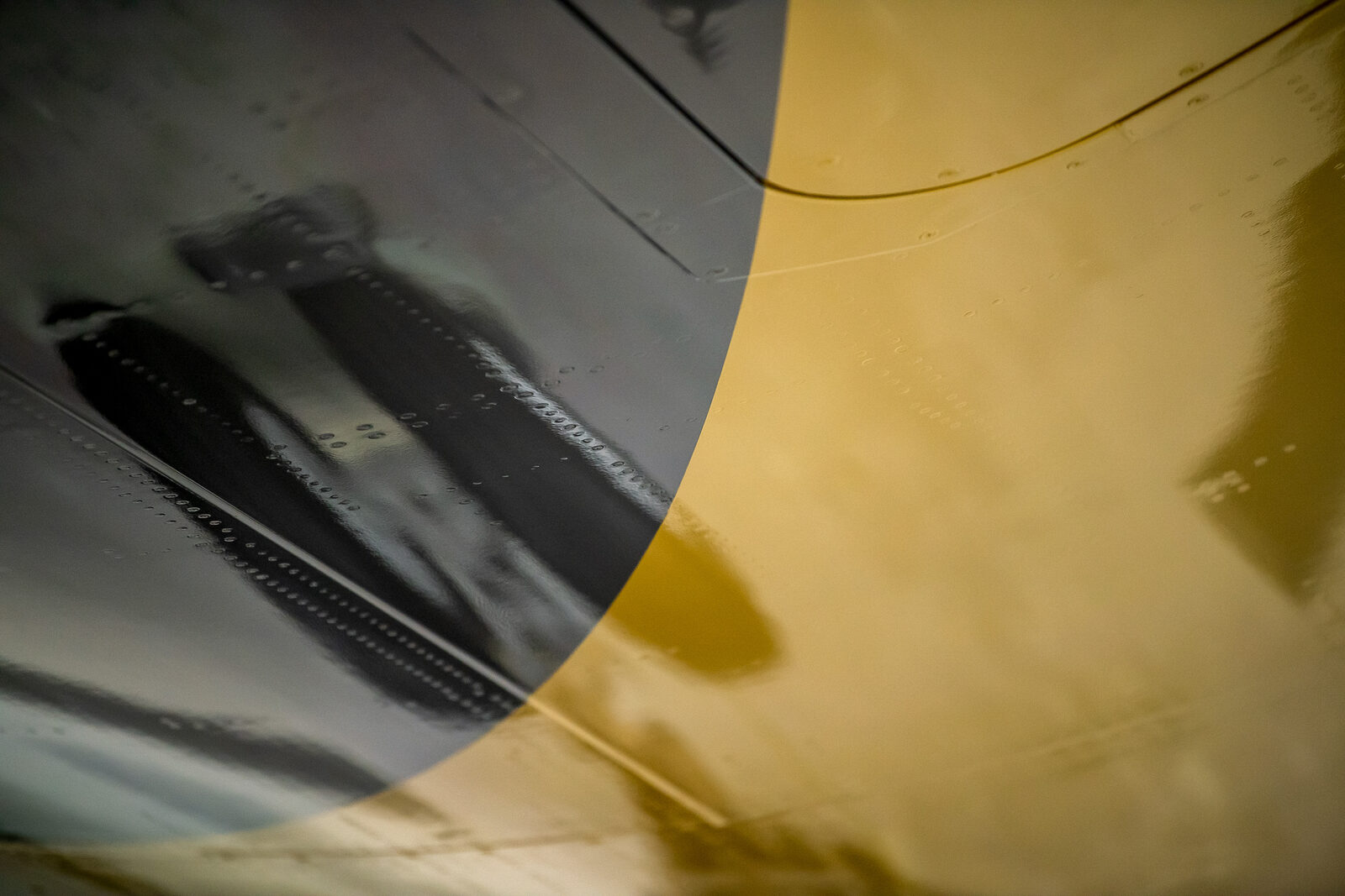
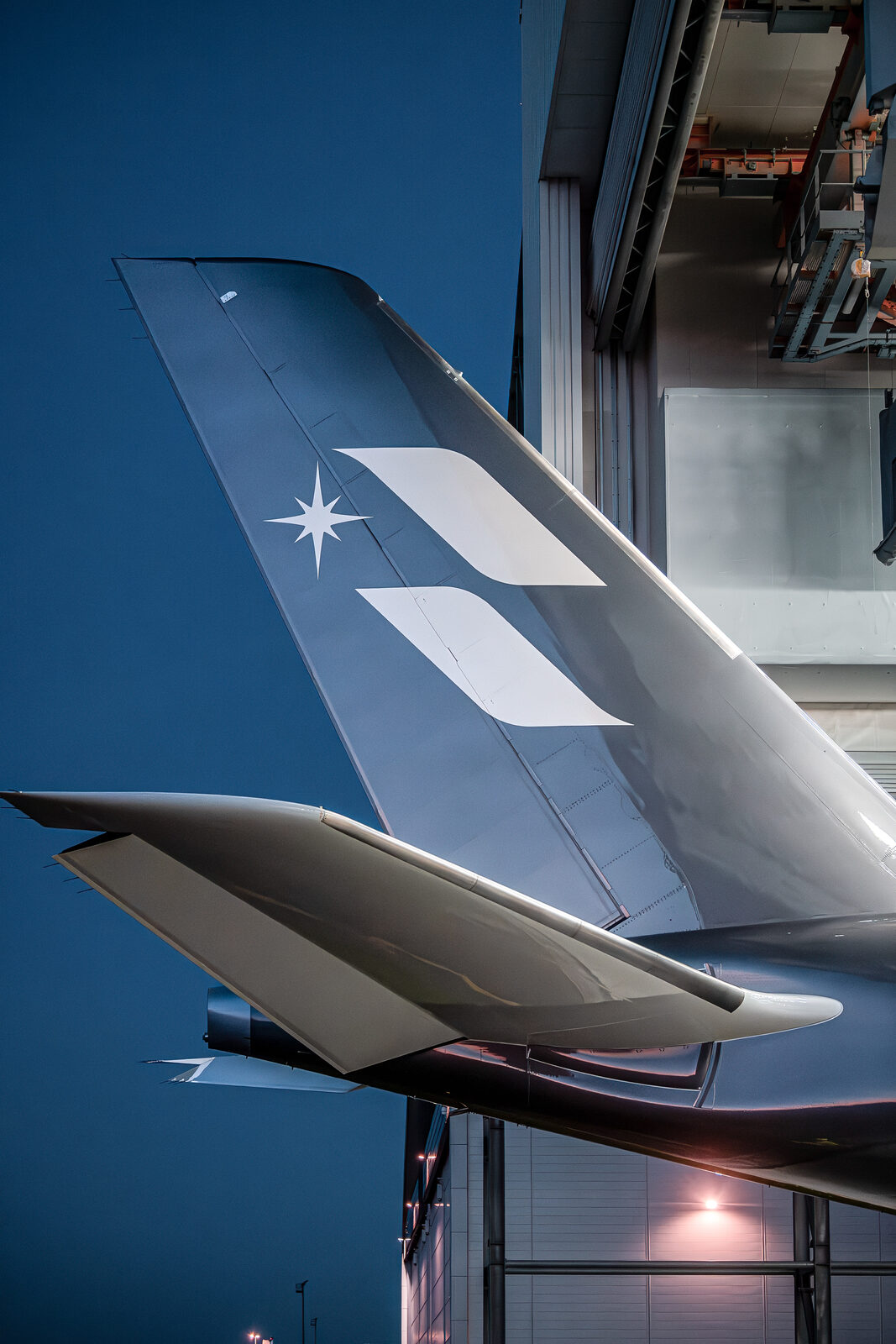
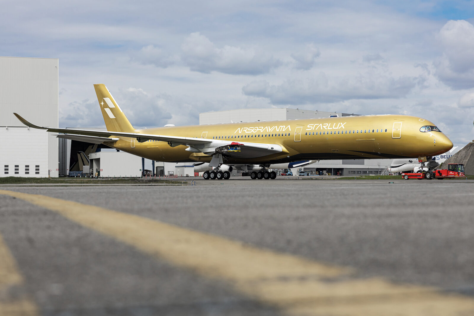
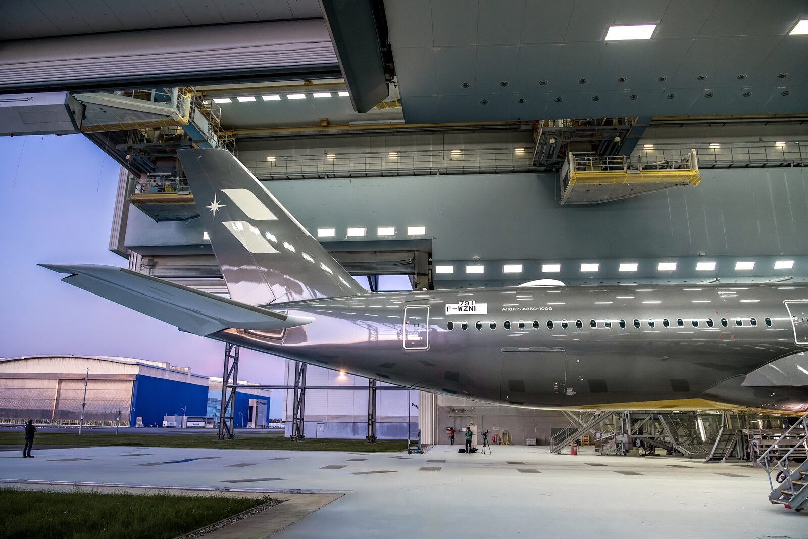
⾊彩の分野で世界的に知られる Pantone は、スターラックス航空と、⽇本を代表する伝説的アーティスト・空⼭基とのコラボレーション「STARLUX AIRSORAYAMA」プロジェクトのために、特別な専⽤カラーを開発しました。空⼭作品を象徴する「銀」と「⾦」の世界観をもとに⽣み出されたこのカラーは、本プロジェクトを象徴するデザイン要素の⼀つとなっています。
Pantone 副社⻑の Laurie Pressman⽒は、「今回のスターラックス航空との協業は、単に⾊を定義するだけでなく、光をどのように“⾒せるか”を定義するものです」と述べています。また、アートと航空機塗装をつなぐ AIRSORAYAMA シルバー機とゴールド機について、「洗練されたメタリックな質感を表現すると同時に、控えめでありながら⾃信に満ちたブランドイメージを映し出し、スターラックス航空による⾰新的な美学の追求を体現している」と語ります。
Pantone は、Airbus 社およびドイツのトップ塗料ブランドである Mankiewicz 社と連携し、⾊彩・光・航空⼯芸の新たな可能性を追求しました。専⽤カラーの開発と⾰新的な塗装技術を通じて、科学・アート・航空⼯学を融合し、これまでにない⼯法で「光」と「⾊彩」を表現。機体そのものを光と影を映し出すキャンバスと⾒⽴て、安全性と美しさを兼ね備えた「空⾶ぶマスターピース」へと⽣まれ変わらせました。
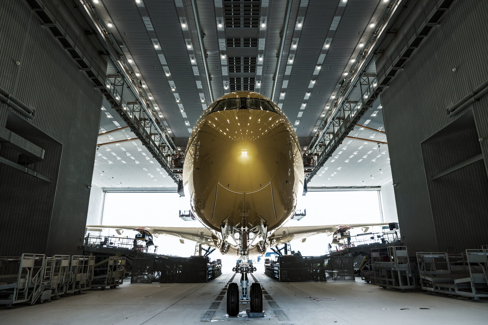
A350-1000 は炭素繊維複合材を採⽤した機体構造に加え、航空規制や耐雷性能などの要件から、鏡⾯のような⾦属表現を施すことが困難とされていました。このため「塗料でいかに光・反射・透明感を表現するか」が開発の⼤きなテーマとなりました。技術検証と⾊味の調整を繰り返し実施し、⼗数回に及ぶ試作と調整を重ねたうえで、最終的に空⼭本⼈の承認を得て、本プロジェクトのための特別なカラー AIRSORAYAMA シルバー機と AIRSORAYAMA ゴールド機が完成しました。
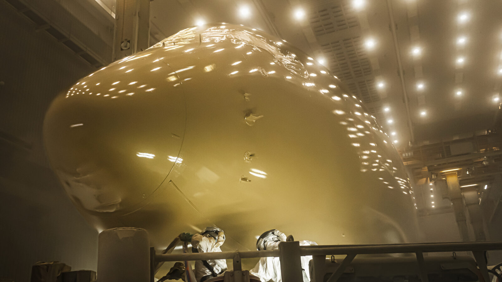
航空機としての安全性を損なわないことを前提に、共同チームは多層スプレー塗装技術を採⽤し、デザイン性と安全性の両⽴を追求しました。光の当たり⽅によって液体⾦属のような輝きと奥⾏きを感じさせる仕上がりを実現し、⾊彩開発から素材の検証、最終塗装に⾄るまで、すべての⼯程で航空⼯学に求められる厳しい基準と、⾼いデザイン品質の両⽴が図られました。
STARLUX AIRSORAYAMA は、単なる機体塗装の変更ではなく、異なる分野の知⾒を結集したプロジェクトでもあります。スターラックス航空は、空⼭基をはじめとする国際的なパートナーとの協業を通じて、航空業界に新たなデザインの発想を取り⼊れ、既成概念にとらわれないブランドの姿勢と、新たな価値の創出に挑戦しています。
塗装誕⽣の記録映像「STARLUX AIRSORAYAMA × PANTONE|光を纏う⾊彩」も同時公開されます。
Pantone, the world authority on color, has developed a bespoke, dedicated color for “STARLUX AIRSORAYAMA” — the collaboration between STARLUX Airlines and Hajime Sorayama, the legendary artist who stands among Japan's most celebrated. Born from the world of “silver” and “gold” that defines Sorayama's vision, the color has become one of the signature design elements of the project.
Laurie Pressman, Vice President of Pantone, remarked: “This collaboration with STARLUX Airlines is not simply about defining a color, but about defining how light itself is shown.” Of the AIRSORAYAMA SILVER and GOLD aircraft that bridge art and aviation livery, she added that they “express a refined metallic quality while reflecting a brand image that is understated yet confident — embodying STARLUX Airlines' pursuit of an innovative aesthetic.”
Pantone worked in partnership with Airbus and Mankiewicz, the leading German coatings brand, to explore new possibilities in color, light, and aviation craftsmanship. Through the development of the dedicated color and innovative painting techniques, the team fused science, art, and aviation engineering to express “light” and “color” by means never attempted before. Treating the aircraft itself as a canvas onto which light and shadow are cast, they transformed it into a “flying masterpiece” that unites safety and beauty.
The A350-1000, with its carbon-fibre composite airframe structure and the demands of aviation regulations and lightning-protection performance, made a mirror-like metallic finish notoriously difficult to achieve. This is why “how to express light, reflection, and transparency through paint” became the central theme of development. After repeated technical validation and adjustments of hue — dozens of trials and refinements — the special colors were finally approved by Sorayama himself, completing the AIRSORAYAMA SILVER and AIRSORAYAMA GOLD aircraft created for this project.
On the premise that aircraft safety must never be compromised, the joint team adopted a multi-layer spray-painting technique to reconcile design and safety. The result is a finish that, depending on how the light strikes it, conveys the luminous depth of liquid metal. From color development through material validation to the final application, every stage was engineered to satisfy both the exacting standards demanded by aviation engineering and the highest quality of design.
STARLUX AIRSORAYAMA is more than a change of aircraft livery; it is a project that brings together expertise from disparate disciplines. Through collaboration with international partners including Hajime Sorayama, STARLUX Airlines introduces fresh design thinking to the aviation industry, challenging convention with a brand attitude unbound by established norms and a commitment to creating new value.
A companion record film chronicling the birth of the livery, “STARLUX AIRSORAYAMA × PANTONE | Color that wears light,” is released alongside.
在⾊彩領域享譽全球的 Pantone,為星宇航空與⽇本傳奇藝術家空⼭基攜⼿合作的「STARLUX AIRSORAYAMA」計畫,開發出⼀款特別的專屬⾊彩。這款⾊彩源⾃象徵空⼭基的「銀」與「⾦」美學世界觀,已成為本計畫最具代表性的設計元素之⼀。
Pantone 副總裁 Laurie Pressman 表⽰:「這次與星宇航空的合作,不僅是定義⼀種顏⾊,更是定義如何『呈現』光。」她並談到連結藝術與航空機體塗裝的 AIRSORAYAMA 銀⾊機與⾦⾊機時指出:「它們在展現精緻⾦屬質感的同時,映照出低調卻⾃信的品牌形象,體現了星宇航空對創新美學的追求。」
Pantone 攜⼿ Airbus 以及德國頂尖塗料品牌 Mankiewicz,共同探索⾊彩、光線與航空⼯藝的全新可能。透過專屬⾊彩的開發與創新塗裝技術,融合科學、藝術與航空⼯程,以前所未有的⼯法詮釋「光」與「⾊彩」,並將機體本⾝視為映照光影的畫布,使其蛻變為兼具安全與美感的「飛⾏藝術品(空中鉅作)」。
A350-1000 採⽤碳纖維複合材料的機體結構,加上航空法規與耐雷性能等要求,使得施作鏡⾯般的⾦屬效果格外困難。因此,「如何以塗料表現光線、反射與通透感」成為開發的核⼼課題。團隊反覆進⾏技術驗證與⾊調調整,歷經⼗數次試作與微調,最終獲得空⼭基本⼈的認可,完成專為本計畫打造的 AIRSORAYAMA 銀⾊機與 AIRSORAYAMA ⾦⾊機。
在絕不損及航空安全的前提下,合作團隊採⽤多層噴塗技術,兼顧設計性與安全性。成品在不同光線照射下,展現如液態⾦屬般的光澤與層次深度;從⾊彩開發、材料驗證到最終塗裝,每⼀道⼯序都同時滿⾜航空⼯程的嚴苛標準與⾼度的設計品質。
STARLUX AIRSORAYAMA 不僅是⼀次機體塗裝的變更,更是⼀項匯聚跨領域專業知識的計畫。星宇航空透過與空⼭基等國際夥伴的合作,為航空產業注⼊全新的設計思維,以不受既有框架束縛的品牌姿態,挑戰創造嶄新的價值。
紀錄塗裝誕⽣歷程的影像作品「STARLUX AIRSORAYAMA × PANTONE|光を纏う⾊彩(纏光之⾊)」亦同步公開。
Pantone, autoridad mundial en materia de color, ha desarrollado un color exclusivo y a medida para “STARLUX AIRSORAYAMA”, la colaboración entre STARLUX Airlines y Hajime Sorayama, el legendario artista que figura entre los más célebres de Japón. Nacido del universo del “plata” y el “oro” que define la visión de Sorayama, este color se ha convertido en uno de los elementos de diseño más emblemáticos del proyecto.
Laurie Pressman, vicepresidenta de Pantone, señaló: “Esta colaboración con STARLUX Airlines no consiste simplemente en definir un color, sino en definir cómo se ‘muestra’ la luz”. Sobre las aeronaves AIRSORAYAMA SILVER y GOLD, que tienden un puente entre el arte y la librea aeronáutica, añadió que “expresan una refinada cualidad metálica y, al mismo tiempo, reflejan una imagen de marca discreta pero segura de sí misma, encarnando la búsqueda de una estética innovadora por parte de STARLUX Airlines”.
Pantone trabajó en colaboración con Airbus y con Mankiewicz, la principal marca alemana de recubrimientos, para explorar nuevas posibilidades en el color, la luz y la ingeniería aeronáutica. Mediante el desarrollo del color exclusivo y de innovadoras técnicas de pintura, el equipo fusionó ciencia, arte e ingeniería aeronáutica para expresar la “luz” y el “color” con un método sin precedentes. Concibiendo la propia aeronave como un lienzo sobre el que se proyectan luz y sombra, la transformaron en una “obra maestra voladora” que reúne seguridad y belleza.
El A350-1000, con su estructura de fuselaje de material compuesto de fibra de carbono y las exigencias de la normativa aeronáutica y del rendimiento de protección contra rayos, hacía sumamente difícil lograr un acabado metálico similar a un espejo. Por ello, “cómo expresar la luz, el reflejo y la transparencia a través de la pintura” se convirtió en el gran tema del desarrollo. Tras repetidas validaciones técnicas y ajustes de tono —decenas de pruebas y refinamientos—, los colores especiales obtuvieron finalmente la aprobación del propio Sorayama, completando las aeronaves AIRSORAYAMA SILVER y AIRSORAYAMA GOLD creadas para este proyecto.
Partiendo de la premisa de que la seguridad de la aeronave nunca debe verse comprometida, el equipo conjunto adoptó una técnica de pintura por pulverización multicapa para conciliar diseño y seguridad. El resultado es un acabado que, según cómo incida la luz, transmite el brillo y la profundidad del metal líquido. Desde el desarrollo del color y la validación de los materiales hasta la aplicación final, cada etapa se concibió para satisfacer tanto los rigurosos estándares que exige la ingeniería aeronáutica como la más alta calidad de diseño.
STARLUX AIRSORAYAMA es mucho más que un cambio de librea: es un proyecto que reúne el conocimiento de disciplinas diversas. A través de la colaboración con socios internacionales, entre ellos Hajime Sorayama, STARLUX Airlines incorpora un nuevo pensamiento de diseño a la industria aeronáutica, desafiando las convenciones con una actitud de marca libre de ideas preconcebidas y con el compromiso de crear nuevo valor.
De forma simultánea se estrena el documental que recoge el nacimiento de la librea, “STARLUX AIRSORAYAMA × PANTONE | El color que viste la luz”.
Press assets on STARLUX media ↗
← News